Virtual Emily
Product design
An internal platform for a remote staffing company. The operation lived in a dozen tools and one enormous Miro board. The job was to turn that board into a product: over a hundred screens, one system.
Context
Virtual Emily places bilingual remote staff, the Emilys, with companies in the US. Seven areas run the business: strategic leadership, commercial synergy, customer service, talent acquisition, finance, technology, and evaluation.
Each area had its own tools. Deals in HubSpot, tasks in ClickUp, activity in ActivTrak, books in QuickBooks, reports in Power BI, the rest in Excel and Teams. Nobody could see the company in one place.
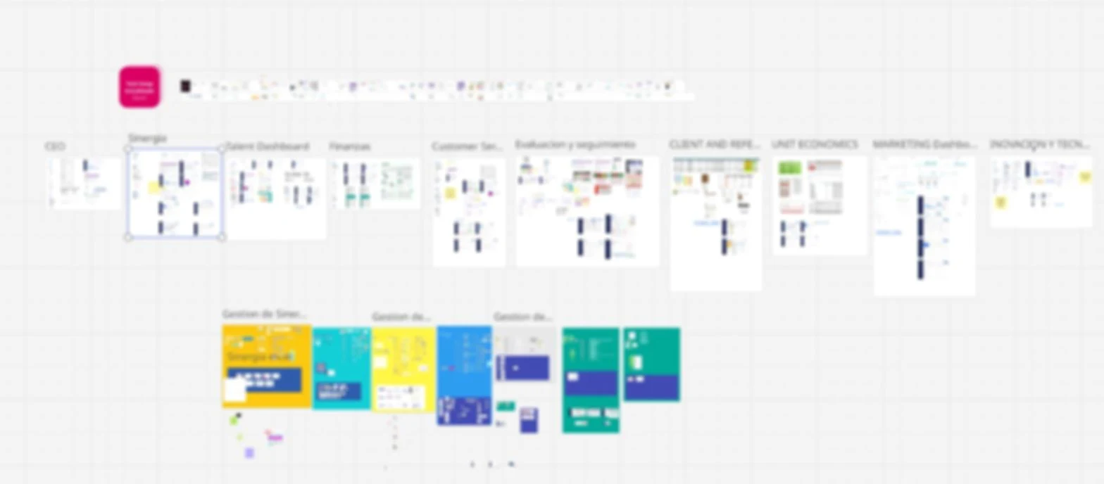
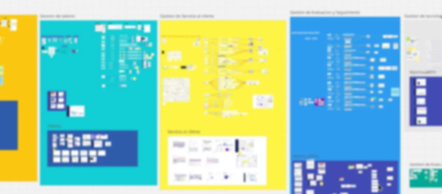
Everything they knew about the operation was on a Miro board. Process maps, tool stacks, meeting cadences, KPI lists, and hundreds of sticky notes with open questions. It was the whole company, and it was unreadable.
From board to structure
The brand came from their creative director. The structure did not exist yet. I worked it out with the CEO, area by area, deciding what data mattered, how it rolled up, and who needed to see it.
The board had a hidden order. Every area answered the same questions: what is the objective, who is on the team, what do we measure, what tools do we use, what do we discuss every week.
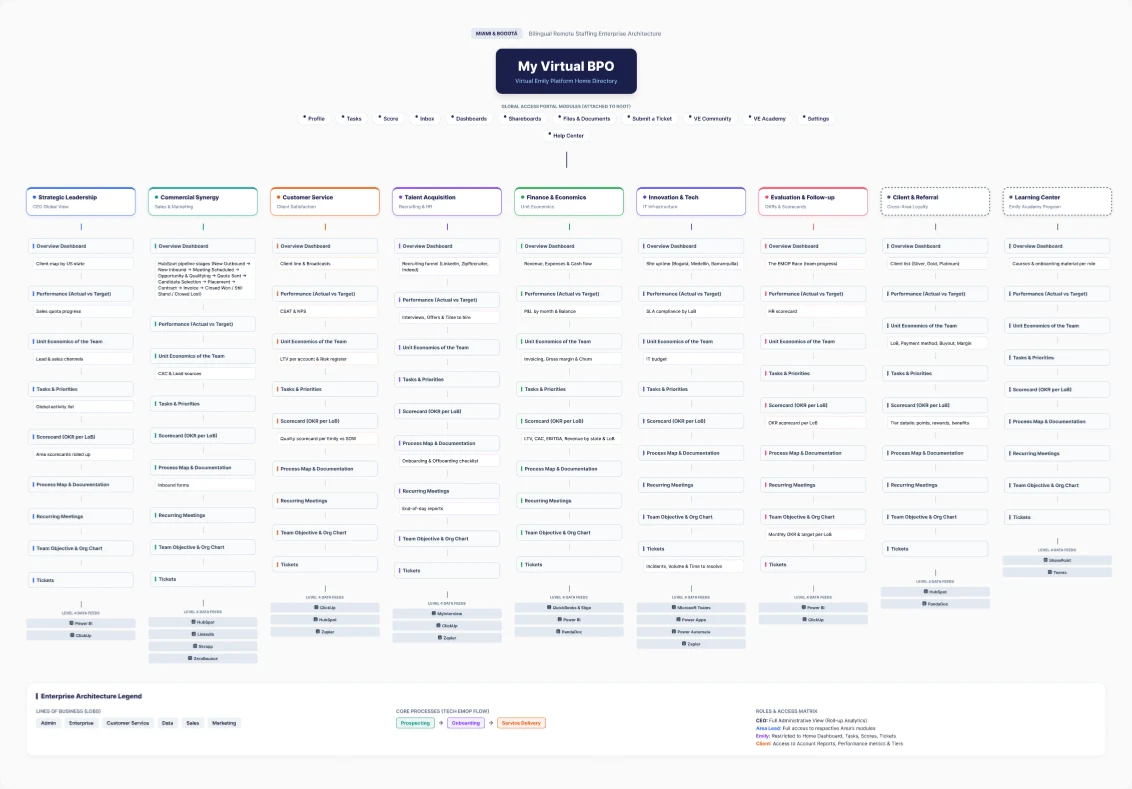
That became the map. Seven management areas and two programs, client and referral and the learning center, hanging off one home. Under every area the same nine modules: overview, performance against target, unit economics of the team, tasks and priorities, scorecard per line of business, process map and documentation, recurring meetings, team objective and org chart, tickets. The tools each area already used became the data feeds at the bottom.
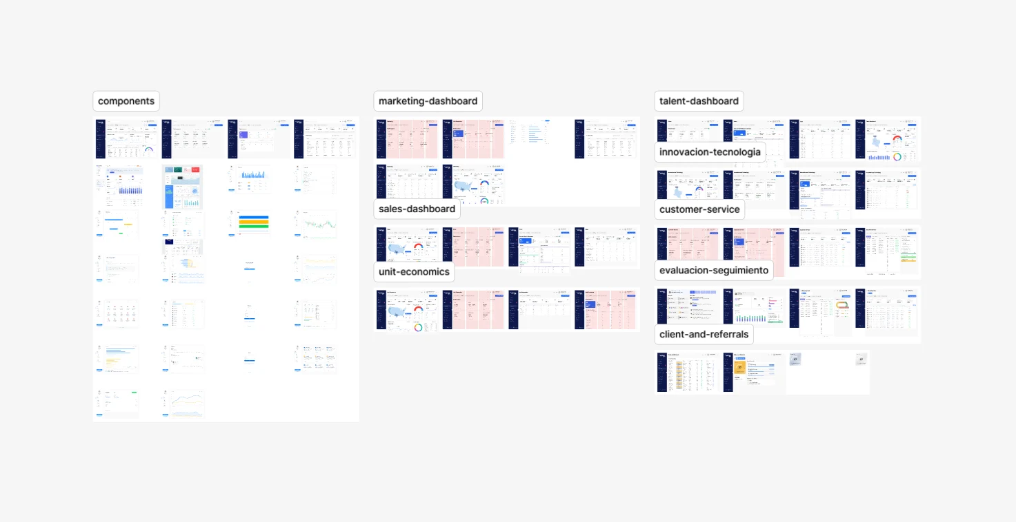
Then the file. One section per area, each built from the same components: a strip of KPIs on top, the detail underneath, one date range and one filter for everything.
How decisions were made
Nothing on the board was invented. Every KPI, feed, and module came from what the areas already tracked and the tools they already used.
I worked in two loops. With the CTO I went through each area's tool stack, HubSpot, ClickUp, ActivTrak, QuickBooks, Power BI, and mapped which data existed, where it lived, and what could actually feed a screen. That decided what was realistic to show.
With the CEO I decided what mattered. We went area by area over the Miro board, picking the numbers each lead needed on top and what could sit below. I brought screens, he approved or sent them back against the data we had. That loop repeated until every area had its overview, performance, and unit economics views.
The same skeleton for every area was a decision, not a shortcut. A lead who learns one dashboard can read all nine.
Finance and economics
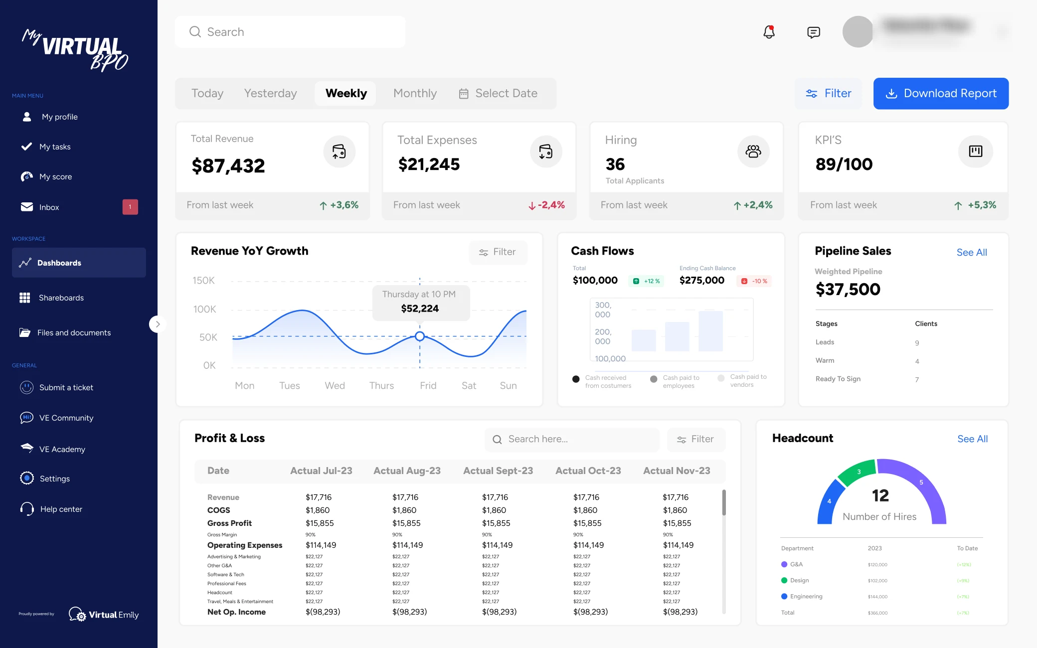
The financial director opens on the week. Revenue, expenses, applicants, and a KPI score across the top, each with its change from last week. Below: revenue growth by day, cash received against cash paid, the weighted pipeline by stage, the P&L by month, and hires by department.
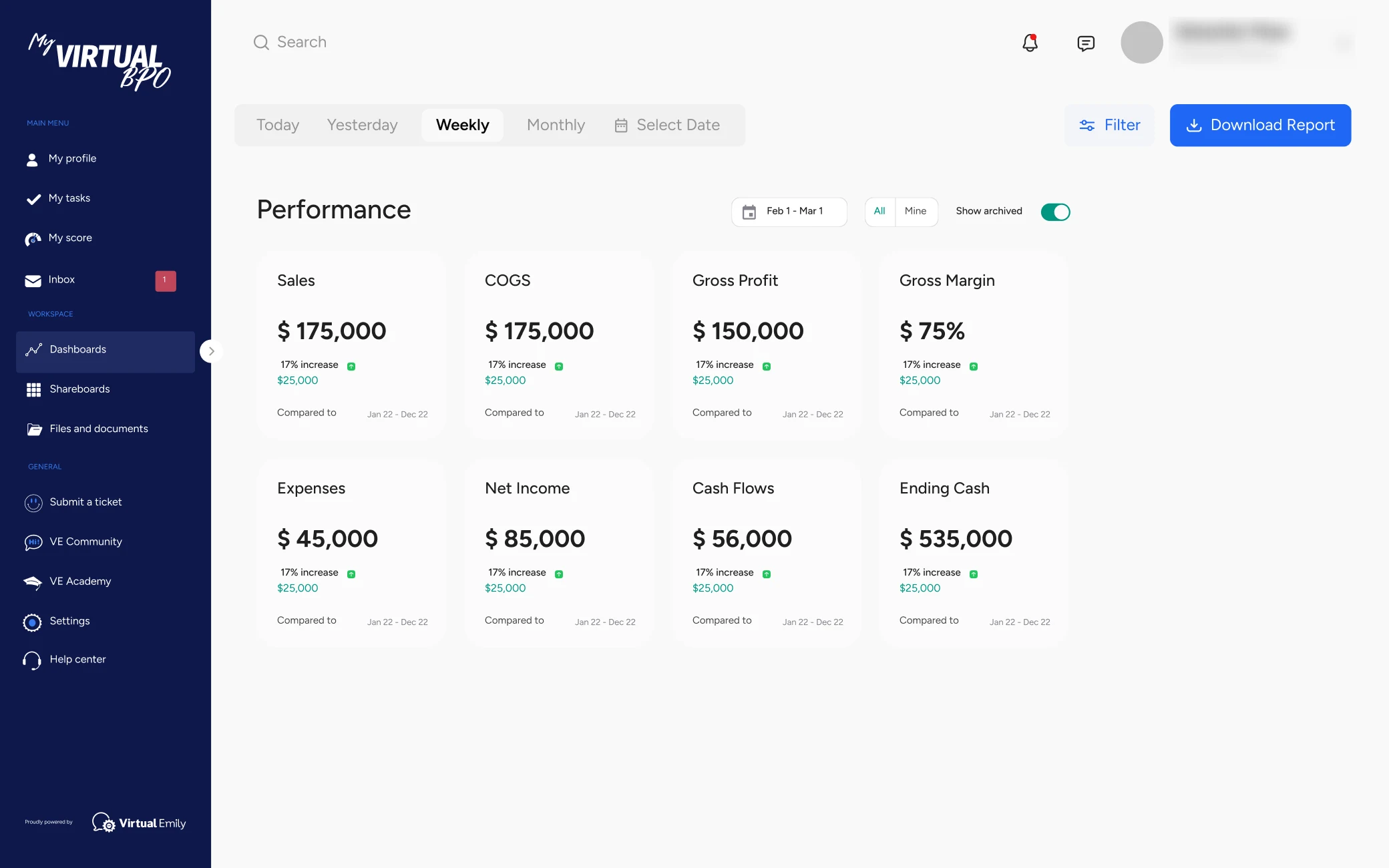
The performance view drops the charts. Eight numbers against the same period last year: sales, cost of goods, gross profit and margin, expenses, net income, cash flow, ending cash.
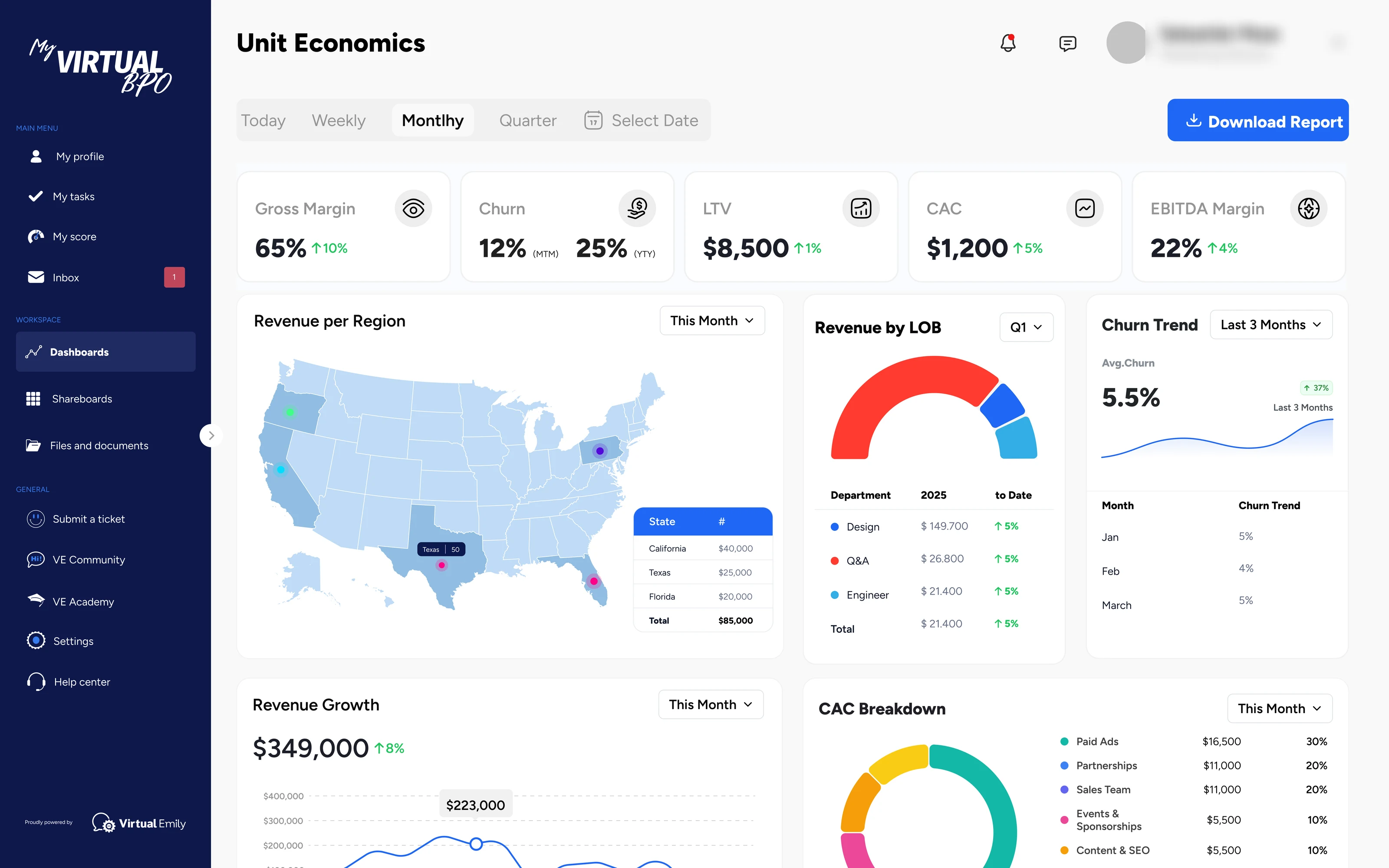
Unit economics is the strategic layer. Gross margin, churn, lifetime value, acquisition cost, and EBITDA margin on one line, then revenue by state, by line of business, churn over three months, and where the acquisition money goes.
Talent acquisition
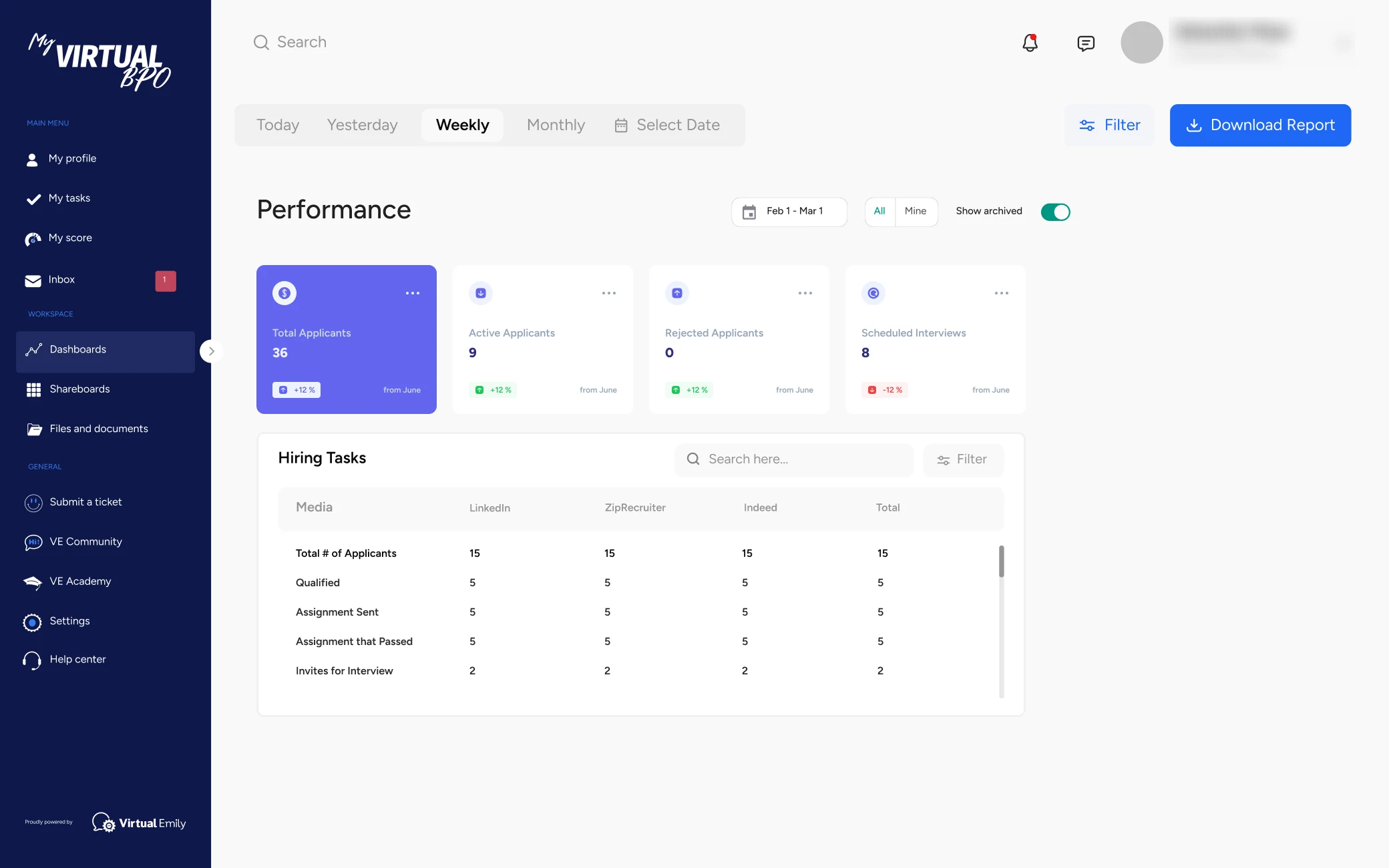
Recruiting is the factory. Applicants by stage on top, then the funnel by channel: LinkedIn, ZipRecruiter, Indeed, and how many made it to an interview.
Innovation and tech
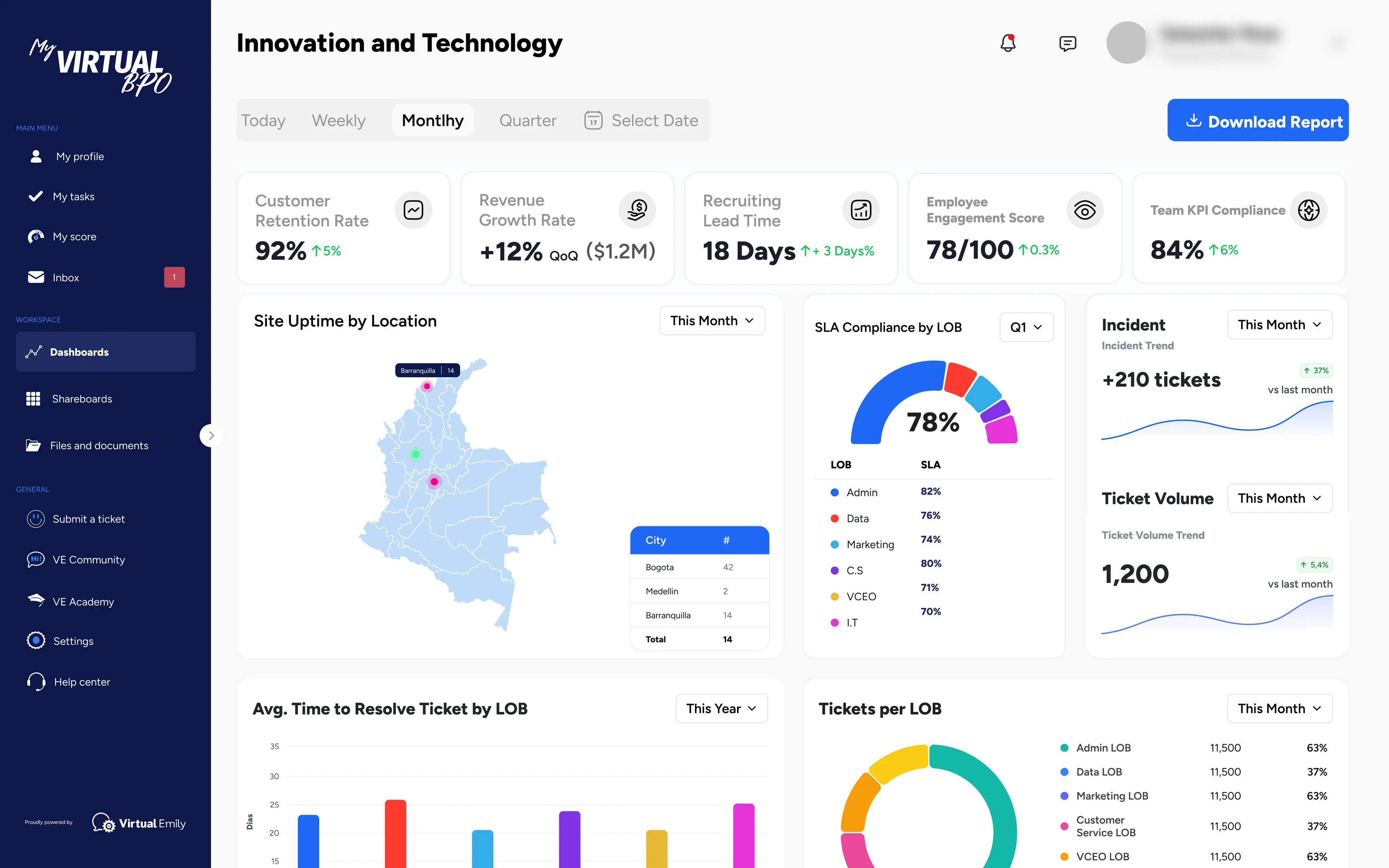
The area that keeps every other dashboard fed. Uptime by office, SLA compliance per line of business, incidents and ticket volume, and how long each area takes to close a ticket.
Customer service
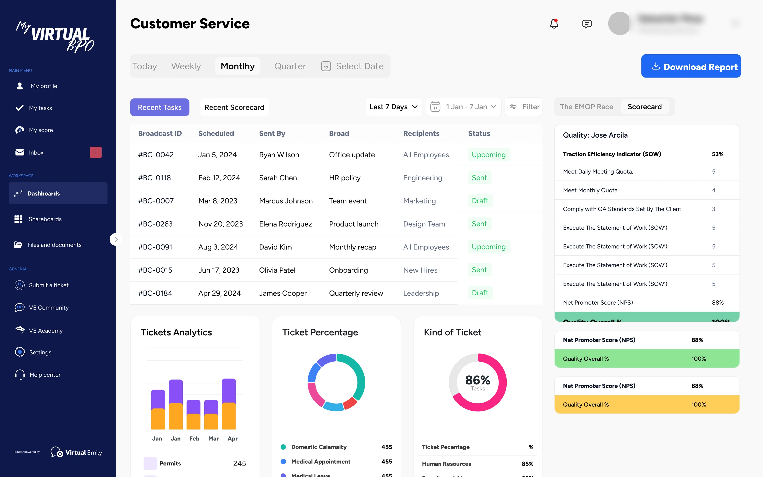
Every client is a line. The area opens on what went out and what came in: broadcasts, tickets by kind, and the quality scorecard of each Emily against the statement of work.
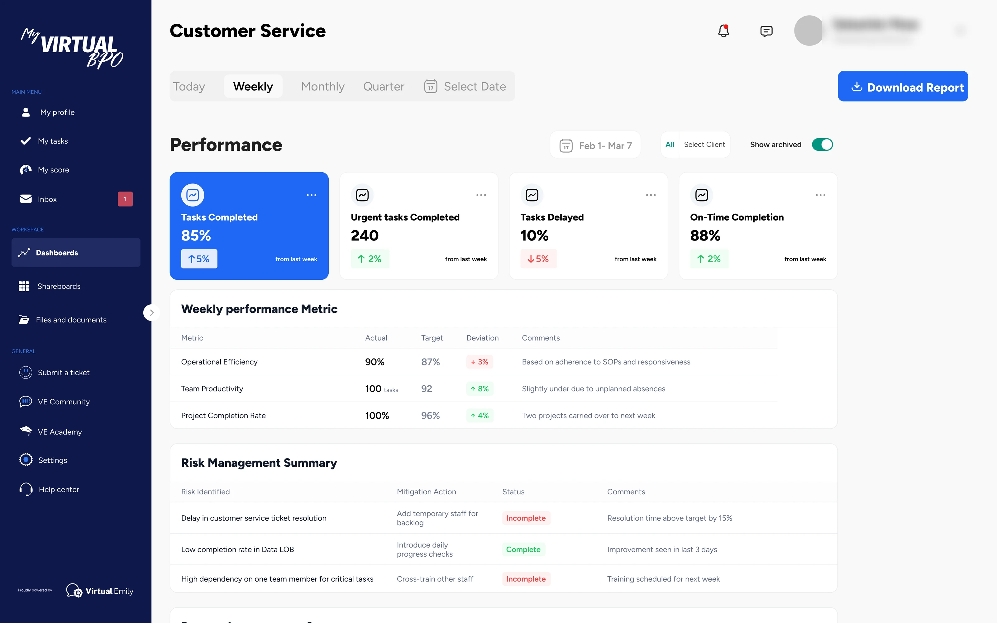
Performance turns that into targets. Tasks completed, delayed, on time, then a weekly table of actual against target with a comment per row, and the risks the lead is tracking.
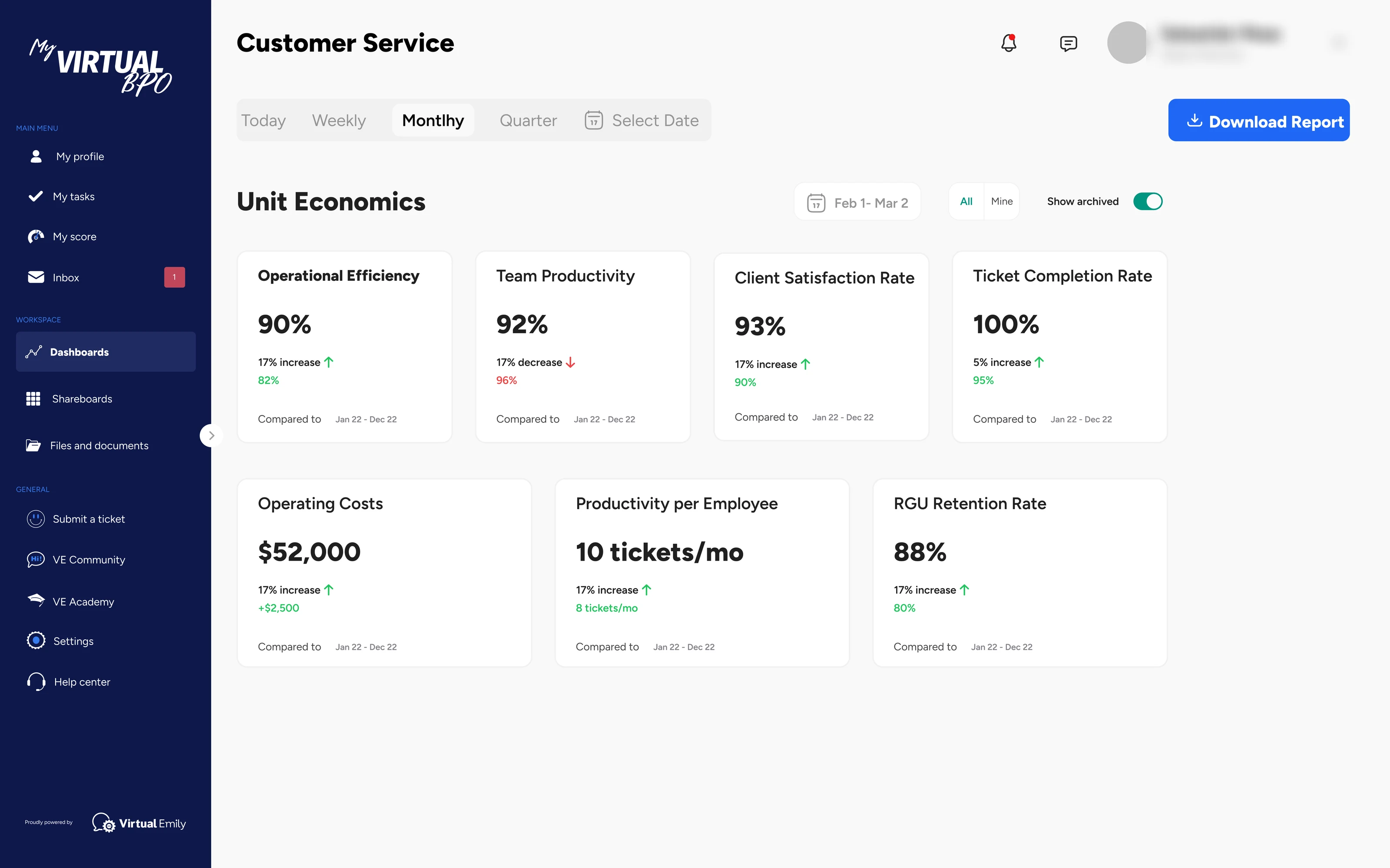
Unit economics closes the loop: efficiency, productivity per employee, client satisfaction, retention, and the operating cost of the team.
Client and referral
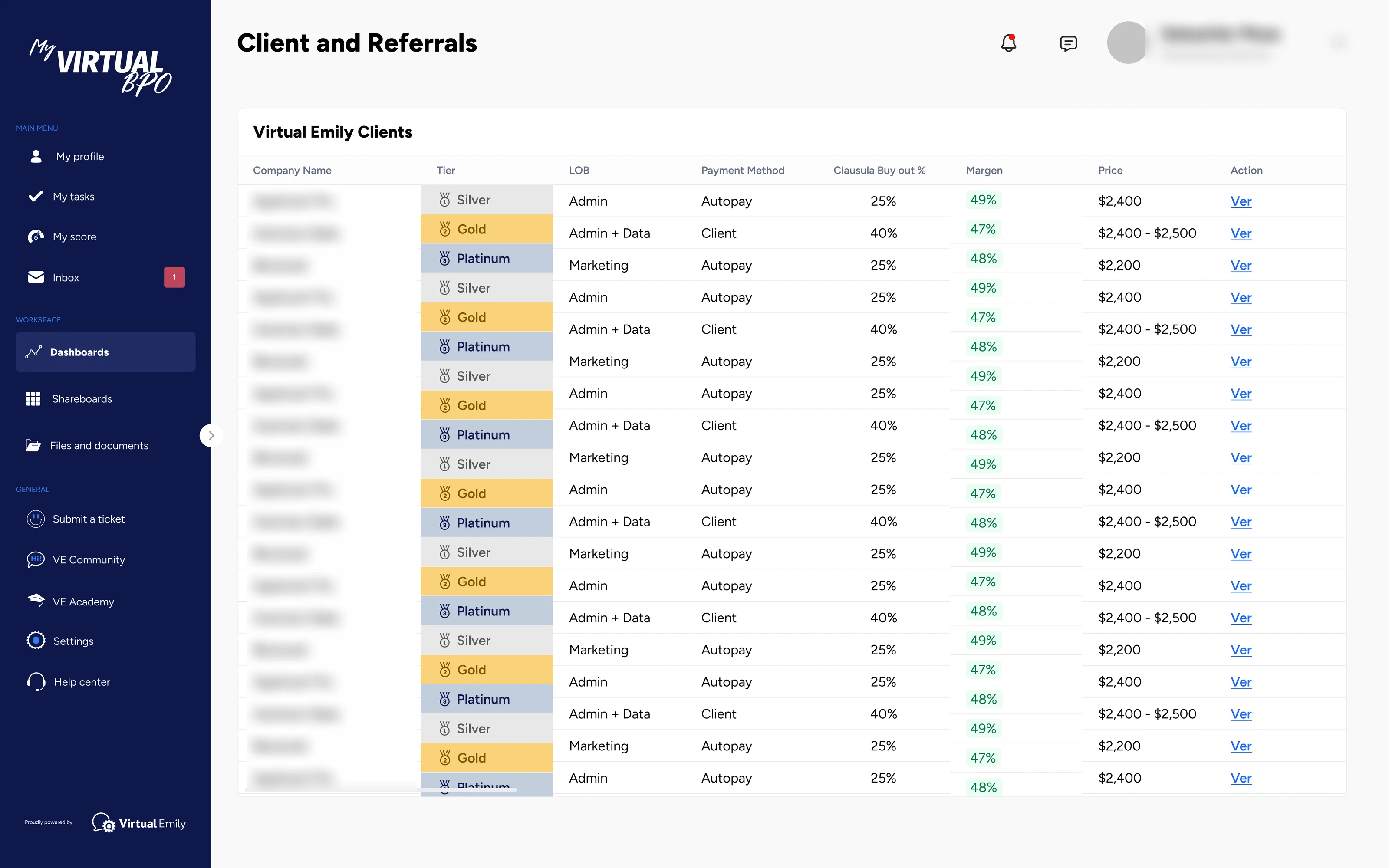
Retention and growth from the accounts they already have. Every client sits in a tier with its line of business, payment method, buyout clause, margin, and price on one row.
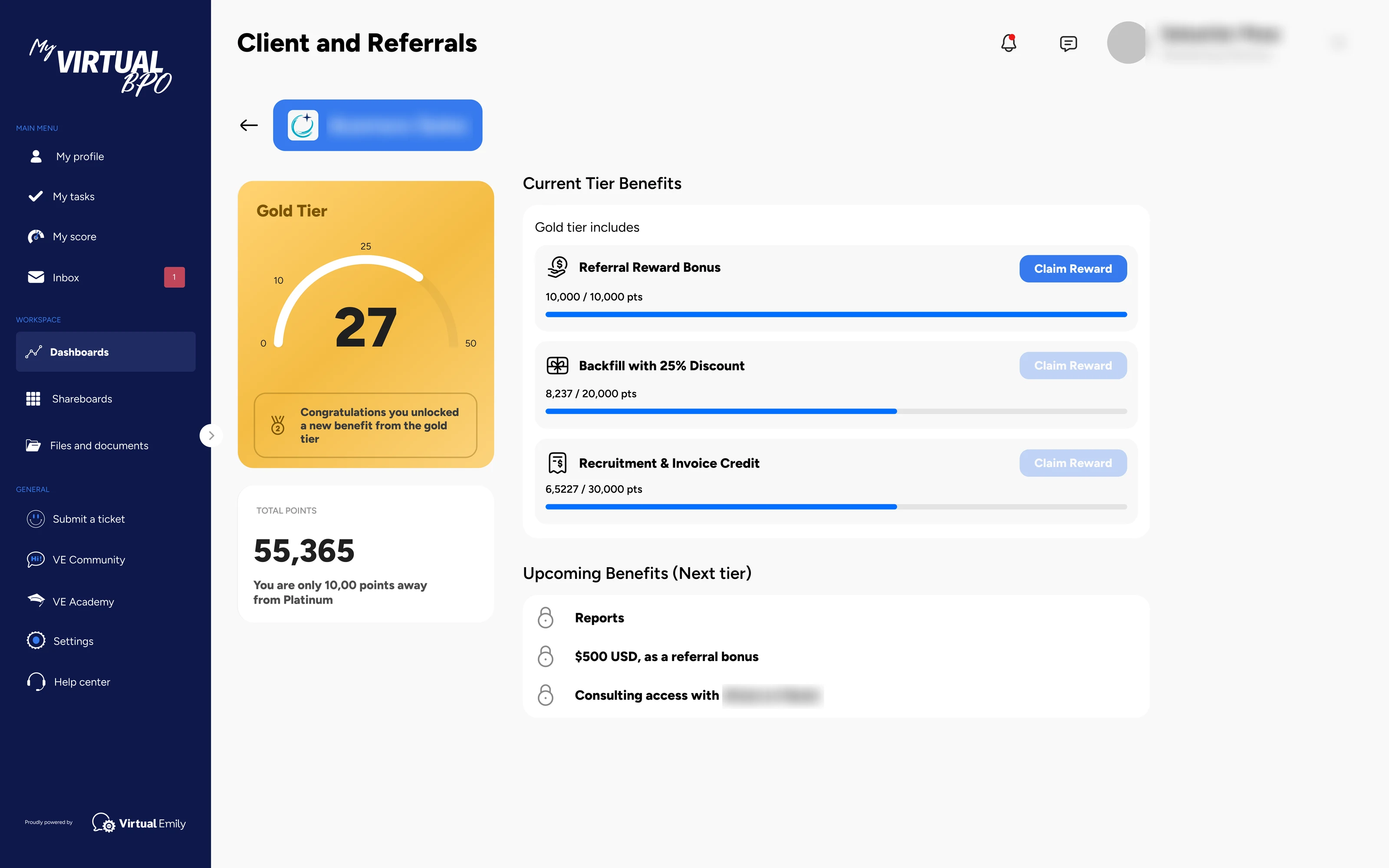
Open a client and the tier becomes a game. Points toward the next level, rewards to claim now, and the benefits waiting one tier up.
What they got
This was a project engagement. I came in with a Miro board and left with a product spec.
The deliverable was one Figma file: the information architecture, the component system, and over a hundred screens across seven areas and two programs, every one mapped to data the company already had. Engineering and data integration were on their side, so the file had to stand on its own. Any engineer could open an area, see which tool fed which chart, and build it without coming back to me.
Before, the company lived in a dozen tools and nobody could see it whole. Now every area has the same three views, the same filter, the same date range. A lead who learns one dashboard can read them all.
I owned the product structure, IA, UX, UI, and the component system for the Virtual Emily app, working directly with the CEO on the data model. Brand came from their creative director. Data integration and engineering were handled by their team. Screens were validated with the CEO against the operational data mapped with the CTO.